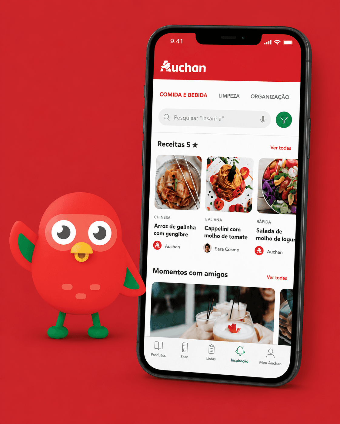
OverView
For an educational brief to enchance an existing retail app, out team focused on Auchan Portugal. Instead of picking a random feature, we analyzed why local costumers hesitate to shop online. This research led us to design Auchie, a personalized virtual kitchen assistant that recommends tailored recipes, content, and shopping lists based on each user's routine, diet and skill level.
The problem
Desk research into Portuguese e-commerce revealed a clear barrier: online grocery adoption lags behind the EU average not due to lack of awareness, but because consumers value the trust and tactile experience of physical stores. To bridge this gap, the app needed to offer utility a physical trip couldn't replicate. This reframed our focus from "what feature can we add?" to "what would make someone choose the app over the store?"
Research
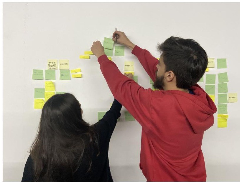
Competitive Benchmarking
Looking outside grocery retail provided key interaction patters:
- SideChef and Yummlly: Personalized dietary onboarding and preference filtering.
- UberEats: Sticky category navigation during vertical scroll.
- Duolingo: Using a friendly mascot to make utilitarian tasks (meal planning) feel enganging rather than like a chore.
User Interview Insights
Interviews across varied life stages revealed four consitent behaviors:
- Daily Habit: Cooking is a relentless, core routine not an occasional task.
- Decision Fatigue: Meal repetition was a major frustration point. Users wanted variety.
- Time Scarcity: Time was a bigger constraint than budget or cooking ability.
- Holistic Demand: High interest in kitchen management (organization, cleaning routines), not just recipes.
Core Design Principle
We distilled our findings into a single guiding principle:
"Next, personalised and adapted to you."
If a feature didn't make the experience faster or more tailored, it was cut.
Persona
We built Raquel, our primary persona, to keep our design choices grounded in a realistic context.
Raquel, 40 "The Homemaker"
Married entrepreneur and mother of two. She is technically proficient and frequently consumes social and DIY content, but manages a packed schedule balancing household tasks and launching her business.
Core Tension: Wants to spend less time in the kitchen and more time with her family and business, without compromising on eating well.
User Story: "As a technically proficient user , I want to access personalised content quickly so I can save time for my family and business."
From insight to concept
Standard search and browse features failed to deliver the speed and personalization Raquel needed. Instead of forcing users to dig through catalogs, we design Auchie, an intelligent assistant that learns preferences once to proactively surface content across three pillars: Food and Drink, Cleaning and Organisation.
Mascot Strategy
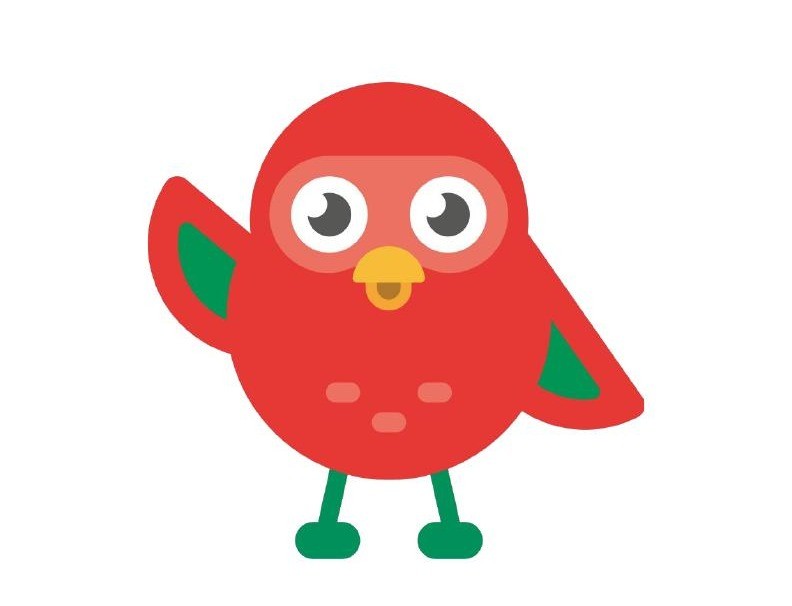
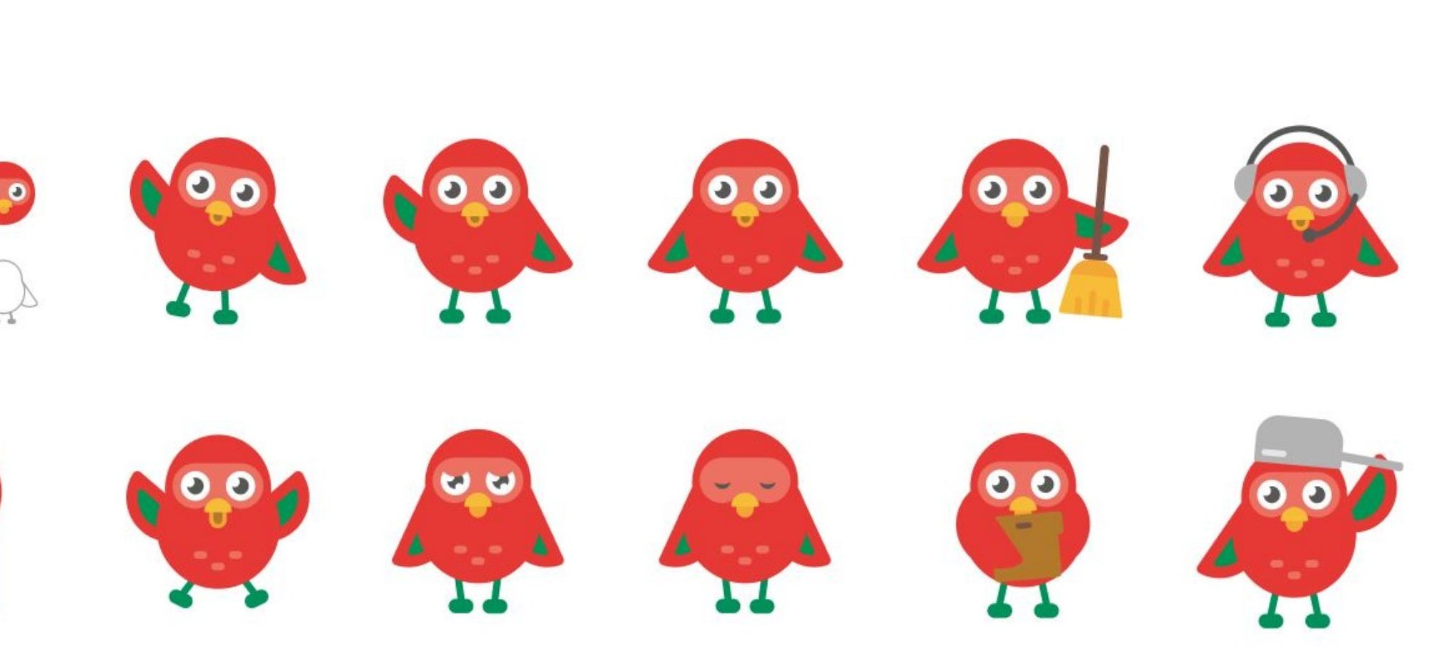
We Gave Auchie a visual Identity, a friendly red bird inspired by Auchan's heritage, borrowing from the Duolingo pettern. A mascot transforms a utilitatian efficiency tool into an approchable companion, giving the app a distinct, warm personality for onboarding, tips, and empty states.
Mapping the experience
We mapped the end-to-end taskflow to ensure Auchie felt fully integrated into the existing Auchan mobile app layout rather than an isolated feature.

Design Rationale
This architecture deliberately front-loads onboarding. By collecting user preferences just once up front, every subsquent session is faster and tailored automatically.
Testing the low-fidelity flow
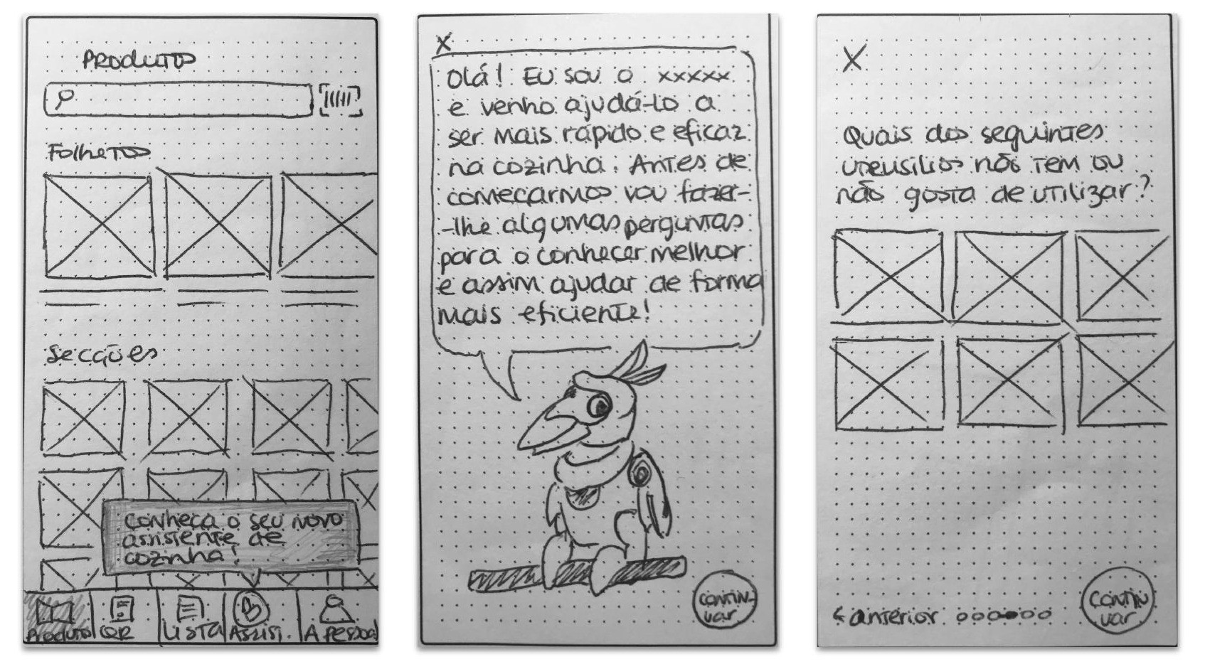
We evaluated early paper wireframers to test entry point readability, onboarding clarity, and filter interactions.
Critical Testing Insights:
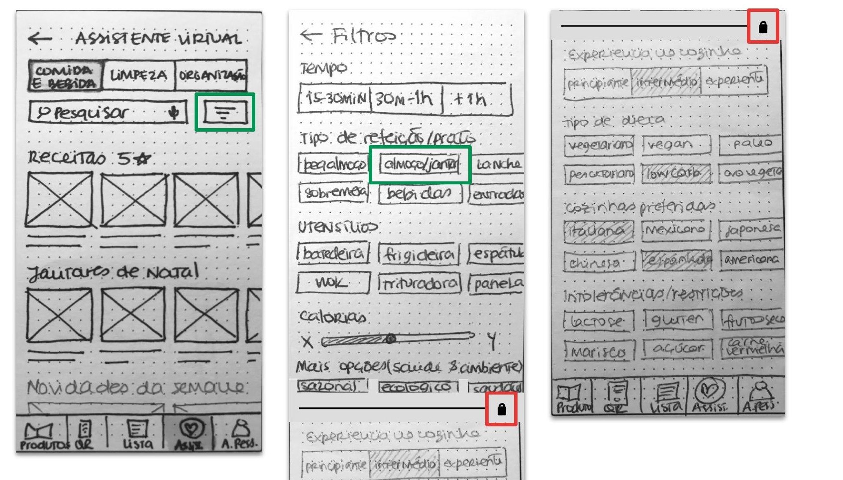
- Confusing Filter Locking: Users were unclear on locked/premium stated, requiring a distinct visual treatment.
- Hidden Horizontal Scrolls: Sideways swipes were consistently missed and stronger visual affordances and subtle peek indicators were needed.
- Missing Post-Filter CTA: Users wanted an explicit next step after filtering rather than inferring what to do.
- Onboarding Drop-off: The multi-screen setup caused hesitation, signaling a need to trim input steps to keep personalization effortless.
- Hands-Busy Cooking Friction: Observing real cooking behavir led us to test voice-command navigation (Pause, Continue, Next Step) within recipe details.
Iteration Outcome:
We streamlined the onboarding sequence, added explicit post-filter CTAs, enhanced scroll visibility, redesigned locked-filter indicators, and integrated hands-free voice controls into the final hi-fi layout.
Visual design
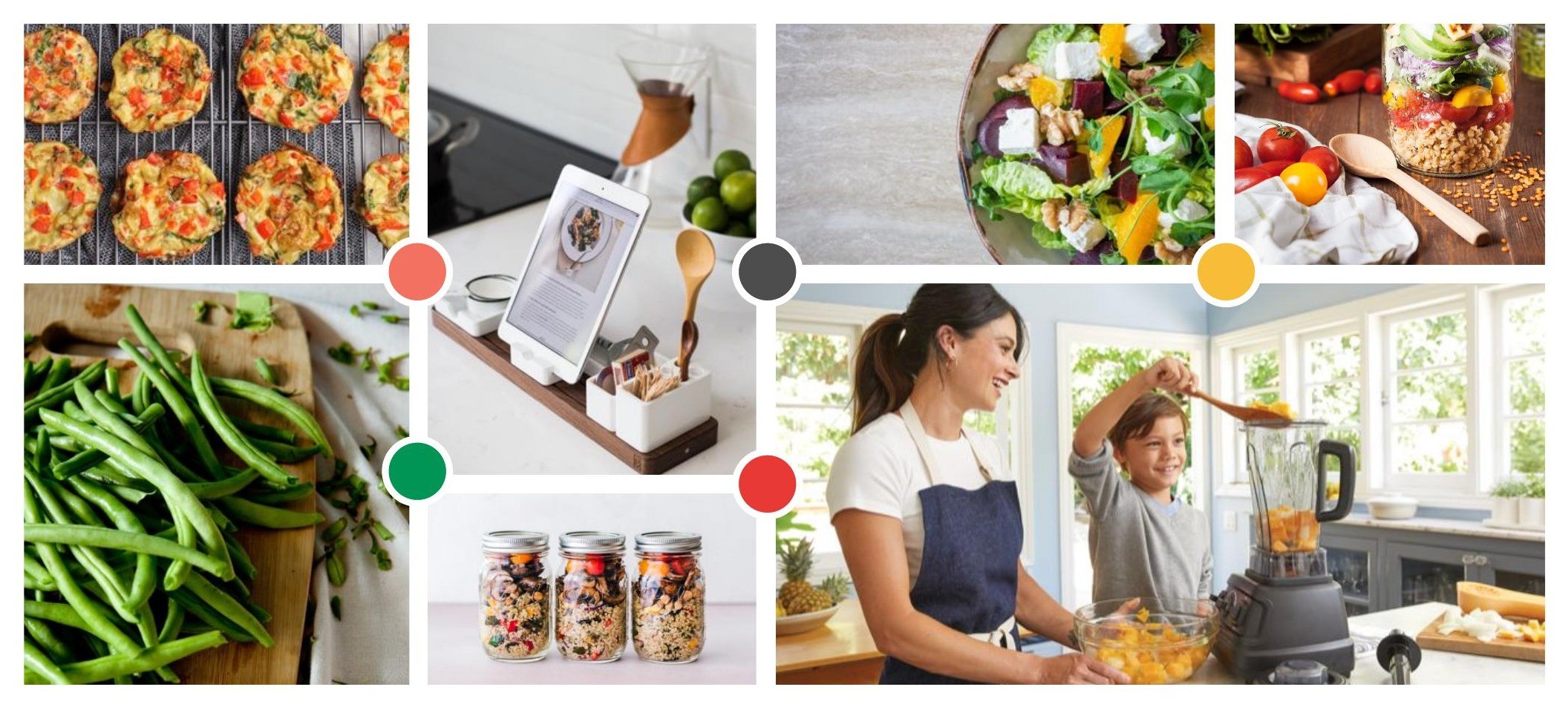
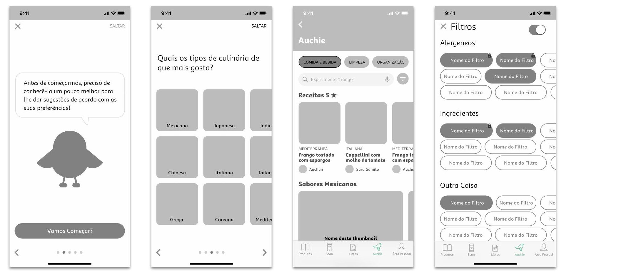
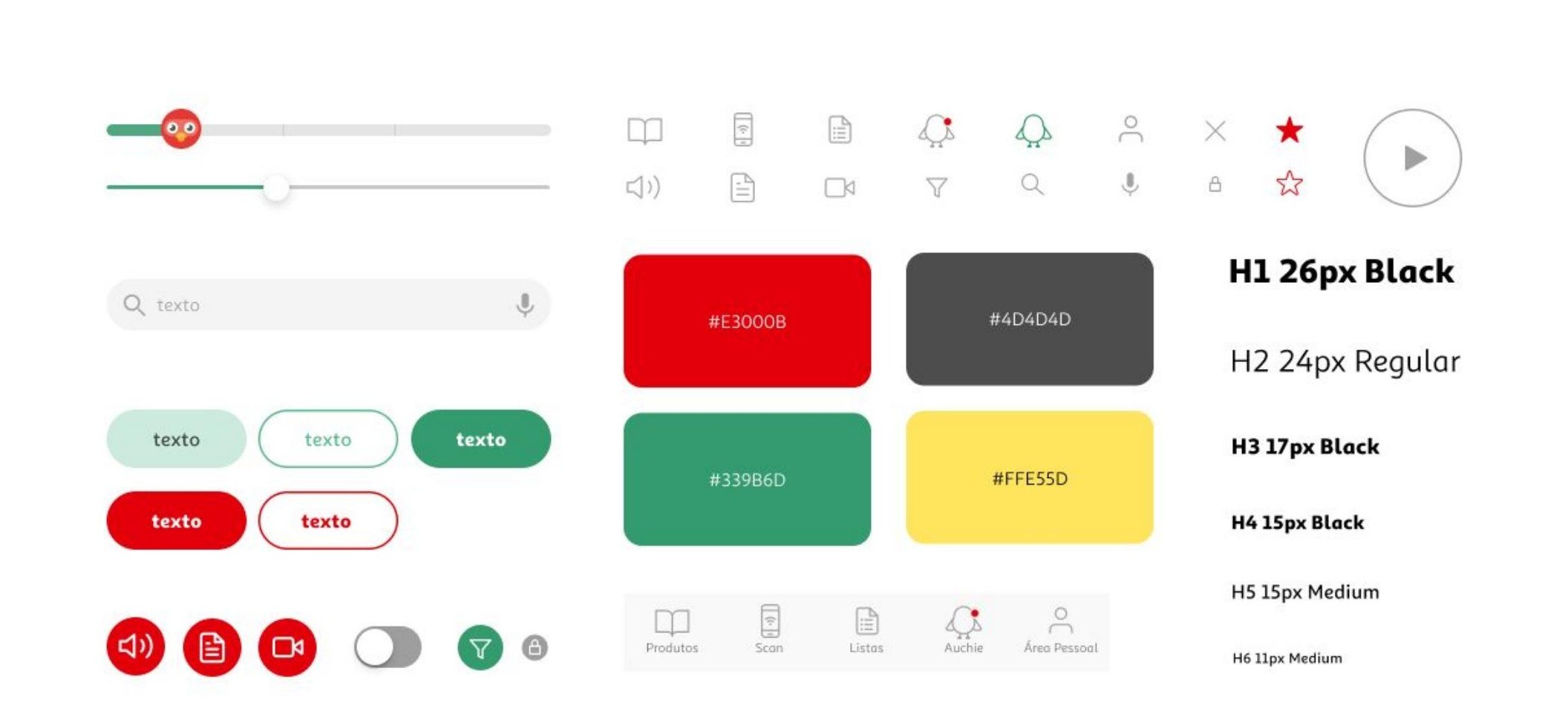
With core interactions validated, we created high-fidelity screens natively integrated into Auchan's existing brand design systems (red, green, yellow, dark grey palette).
- Design systems and Component Kit: Built reusable buttons, tags, custom icons and typography scales to ensure visual consistency across all touchpoints.
- Contextual Mascot Library: Created an "Auchie Kit" featuring custom mascot poses (chef, cleaning, listening, resting) that respond dynamically to active tasks and empty states.
- Ecosystems Onboarding: Designed contextual entry points across web and mobile platforms (e.g., "Welcome, Raquel! I'm Auchie, your kitchen assistant") for effortless, natural feature discovery.
Crafting a sanctuary of minimalism and nature
Reflection
Key Takeaway: Upfront research drastically streamlines tge solution space. Grounding our decisions in market barriers and user interviews ensured that our core direction, speed and personalisation via an approachable brand mascot was dicatated by evidence rather than assumptions.
Future Production Validation: If taken further, the next step would be measuring performance against quantitative metrics:
- Time-to-Task Efficiency: Testing whether the assistant significantly reduces average time-to-recipe selection.
- Long-Term Preference Adaptation: Evaluating how well a single-time onboarding model holds up as user routines and dietary needs evolve.